The kitchen as a canvas
She is a creative practitioner, he is a photographer – right from the outset, Natalie Fry knew that the new kitchen for this artistic couple needed to be anything but ordinary. As a result, the interior designer and her team created a cooking area with a sleek design and subtle functionality to give their clients maximum freedom to showcase their quirky style.
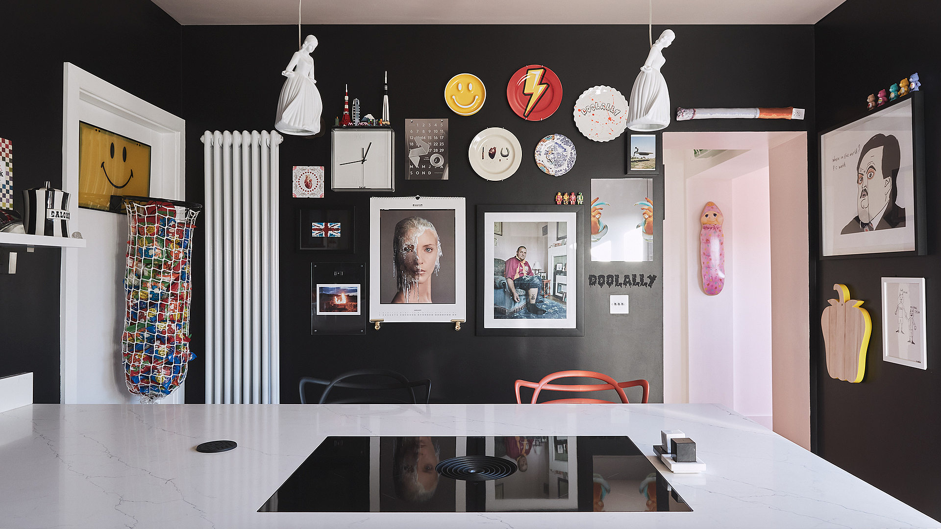
A yellow lightning bolt on a red plate, a calendar page featuring a portrait of a woman with an icefall down half her face, a clock with a miniature skyline perched on top – each and every piece is eye-catching in its own right. Jointly displayed on the black wall of this kitchen in Yorkshire, England, however, the pictures and decorative elements become a unique work of art. They belong to a collection of intriguing objects, paintings and photographs owned (as you would perhaps expect) by a very creative couple. She is a creative practitioner, he is a professional photographer whose portfolio includes celebrities such as David Beckham, Pharrell Williams and Ed Sheeran.
Their ability to showcase their unique style was part of the brief they set when approaching the kitchen and interior design studio Grid Thirteen. “The owners wanted a kitchen that would blend into the architecture so that they could showcase their eclectic artwork and accessories in a fitting setting,” explained studio owner Natalie Fry. “They also didn’t want the kitchen to look too functional.” The idea of a workspace as a blank canvas that could be repeatedly refilled with life and art was born.
Cooking in a gallery
Before the design idea could be made a reality, however, it was first necessary to create the foundations. “The kitchen was initially located in a dark, narrow corridor that offered little space to move around and work,” the designer recalls. Fortunately, the house also had another living room, which was much better suited for cooking and baking, socialising and chatting and eating and drinking than the cramped hallway by the stairs. Natalie Fry therefore suggested moving the kitchen to the almost square-shaped room. A further major benefit of such a ‘move’ was that the kitchen would benefit from plenty of natural light through the large windows in the bifold doors. This also enabled the room to be used as a bright workspace for the two creative professionals. The proposal was accepted: the old kitchen units were removed to create a spacious connecting room and the new units moved into the former living room.
As per the client brief, the Grid Thirteen team designed and built a kitchen in which everything is low key. Simple lotus white cabinets, a white quartz worktop and, last but not least, a BORA cooktop with an integrated downdraft extractor come together to create a calm and unobtrusive design, as Natalie Fry explains: “The cooktop needed to be a central part of the peninsula to enable interaction while cooking. However, under no circumstances could we let an extractor hood create a visual block between the cooking area and the seats along the kitchen counter.” Thanks to the very quiet BORA Pure cooktop extractor, the view across the peninsula remains clear, sociability is ensured and the kitchen design is sleek and tranquil.
This makes the surrounding decorative features all the more dramatic: porcelain-white light shades in the shape of women hang from the delicate pink ceiling and a conglomerate of art and design objects seemingly thrown together at random adorn the black wall. It is hard to know where to look first: at the picture of a boy sitting on a UFO or perhaps at the skateboard on which several apples and nectarines are decoratively displayed?
Info
Kitchen design: Grid Thirteen, www.gridthirteen.co.uk
BORA Pure
Photos: Neil Bedford