Minimalist loft surrounded by canals
AN APARTMENT THAT CAPTURES THE BEAUTY OF AMSTERDAM’S CITY CENTRE WHILE ALSO CONVEYING A SENSE OF FREEDOM. CO-RESPONSIBLE: BORA Basic.
“The aim was to create a modern building with a bright, clean interior”, states interior designer Willem Benoit in explanation of the architectural concept behind the renovation of the period property alongside a canal in Amsterdam’s Old Town. Inside is an apartment that aims to offer the calmest of atmospheres as a contrast to the hustle and bustle on its doorstep. After all, the red-brick house on the Prinsengracht canal is in one of the Dutch capital’s most famous and most popular districts.
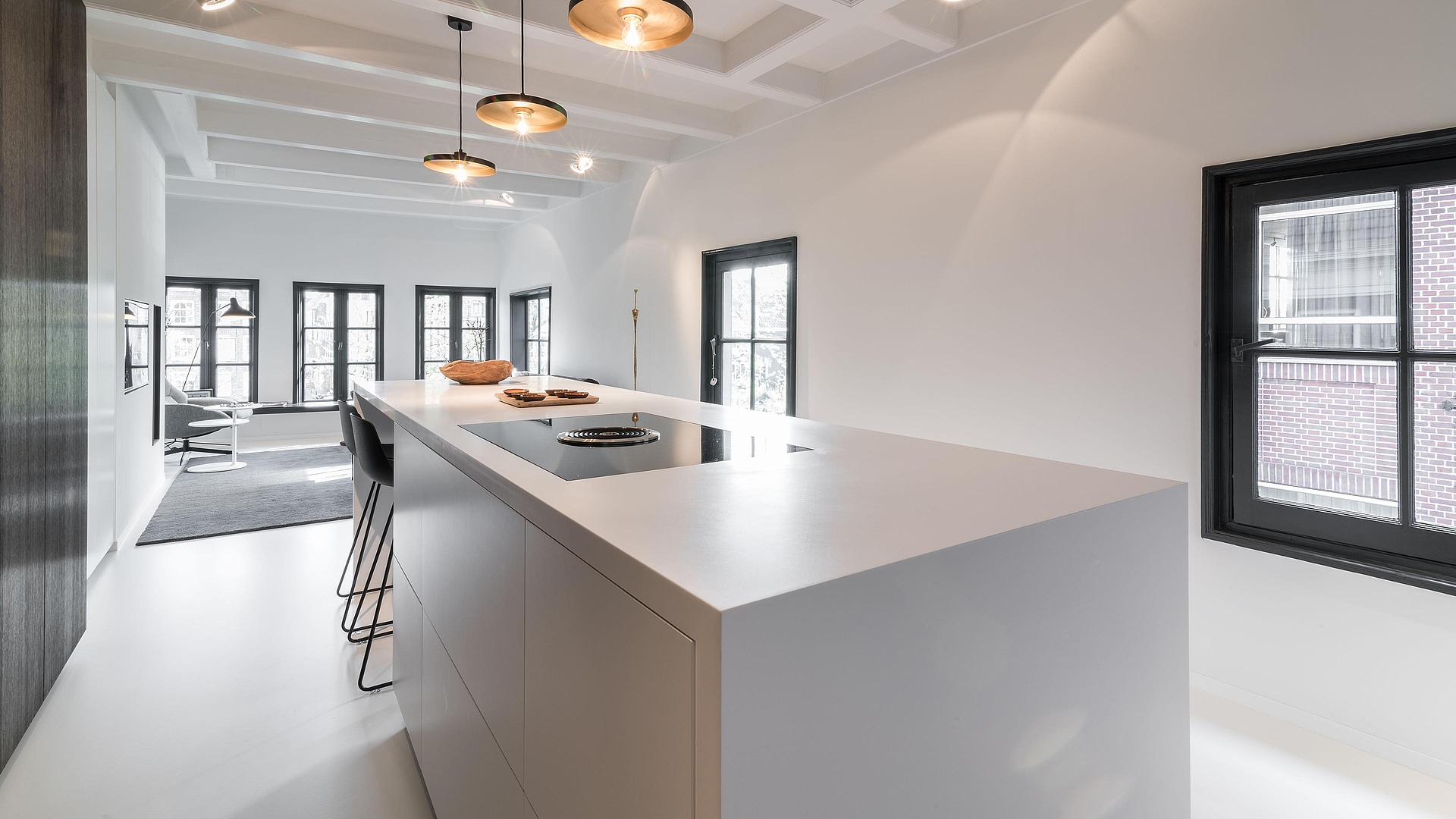
The results of the complete refurbishment are all-round impressive: open-plan rooms combine with expansive window areas to give a sense of home living shaped by freedom and light. And at the heart of it all, a sleek kitchen island with BORA Basic, a beautifully designed, compact system comprising a cooktop with an integrated extractor fan.
The living area is entered through a gateway-like, floor-to-ceiling glass door with a dark iron frame. The similarity to the windows all around the room is intentional. It creates a sense of peace. As does the uniform white shade of the ceiling, walls and floor, which also makes the room feel more spacious. Even the kitchen counter directly behind the glass door is a radiantly crisp white. The finish on the side walls and kitchen worktop made from HI-MACS® artificial acrylic stone matches that of the floor, seamlessly integrating the kitchen island into the overall look.
Everything feels minimalist, reduced to the bare essentials. The interior design holds back so as not to steal the show from the impressive views of Amsterdam’s unique streetscape.
Several interior design tricks have been used to ensure that the eye can fully focus on the views of the city without trivial distractions. One of these is the kitchen design: the kitchen cabinets disappear into the walls and look like built-in wardrobes. Few people visiting the apartment for the first time suspect that a sink and kitchen appliances hide behind the floor-to-ceiling cupboard doors. And this enables the island-like kitchen counter to grab their attention. It is perceived as a stand-alone feature.
Another point: thanks to the BORA Basic cooktop extractor system, the counter looks more like a reception table for guests than a kitchen – the ideal place from which to enjoy the view while sipping a welcome cocktail.
“THE AIM WAS TO CREATE A MODERN BUILDING WITH A BRIGHT, CLEAN INTERIOR.” - WILLEM BENIOT
Thanks to the cooktop extractor, which draws cooking vapours away downwards, the ceiling remains clear, enabling views both out of the windows and of the original wooden ceiling beams. This was another thing that was important to Willem Benoit. After all, traditional building materials such as wood and iron are repeatedly found throughout the interior – out of “respect for the original architectural features”, as Benoit emphasizes.
In renovating this period apartment, his vision of a clear and bright home with links to its unique surroundings became a reality.