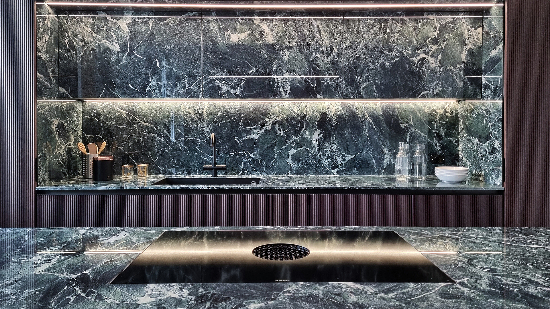
A new twist on a 1930s kitchen
This kitchen is a class of its own. The kitchen planner succeeded in creating a harmonious look by combining marble, wood and metal, guided by the style and proportions of the architecture. The kitchen blends in seamlessly with its penthouse apartment setting. It takes on the charm of the 1930s building, just a few kilometres away from Lake Como, giving it its very own new twist.
Photo credits:
Kitchen design: Turati Cucine SRL, www.turaticucine.it
BORA X Pure induction cooktop with integrated cooktop extractor
Photos: Lorenzo Tagliabue
When the young couple visited the penthouse apartment for the first time, it was not in a good state. However, they both immediately saw the potential in the 1930s building, just a few kilometres from Lake Como. High ceilings, elegant coving on the walls, old herringbone parquet and a breathtaking 360-degree view of the mountains and the Milan skyline in the distance won them over. They bought the 208 square metre apartment and got started on the renovation. Their profession was of great help: both work in the field of design and so have an eye for style and coordinating materials.
Keep the old, create the new
During the renovation, it was important to them to keep the essence of the original building. They modernised it carefully, without covering up the special features of the old masonry. The heart of the apartment is formed by an approximately 35 square metre room with an octagonal layout, high ceilings, and moulding on the walls. The owners love to cook and invite friends round for meals. It’s only logical that they would put the kitchen and dining area in this room in the centre of the apartment. The kitchen design was also important to them and they placed this in the hands of Marco Turati and his kitchen studio Turati Cucine in Meda.
Modern with reminiscences of past times
‘The idea for the kitchen design came about in the intention of using modern furnishings in the apartment without interfering with the context of the building,’ Marco Turati explains. So he combined modern, minimalist lines with top-quality materials and surfaces reminiscent of the style in the year the building was erected. ‘This blend gives the kitchen charm and elegance and creates a warm, sophisticated atmosphere,’ he says.
As was typical of the mid-century modern style, which started in the 1930s, the kitchen speaks a scaled down but highly sensual design language. A lively, veined marble-effect ceramic worktop crowns an island unit with a shiny, metallic copper lacquered surface, the reddish metallic shine of which is repeated in the bar stools. The greenish marble look is replicated on the overhead units nearby. Like a photo mount, the dark walnut fronts of the kitchen units frame the recess cladded in ceramic marble.
Technology in a classy designer dress
Nestled amongst this combination of top-quality materials is kitchen technology that is contemporary through and through. In the kitchen island we can find a BORA X Pure cooktop with its silent, high-performance downdraft extractor. The cooktop system is seamlessly built into the worktop where it virtually disappears. ‘We didn’t want an extractor hood hanging from the ceiling,’ Marco Turati explains opting for BORA. ‘That would have obscured the marble cladding and distracted from the walls. We wanted the kitchen to have a fully open-plan design with no structural or visual obstructions.’ Because the inhabitants like to cook for guests, the kitchen planner turned the cooking area to face the stools and the large dining table in front of the kitchen island. His summary: ‘This makes the whole room convivial and conversation can be had with all.’