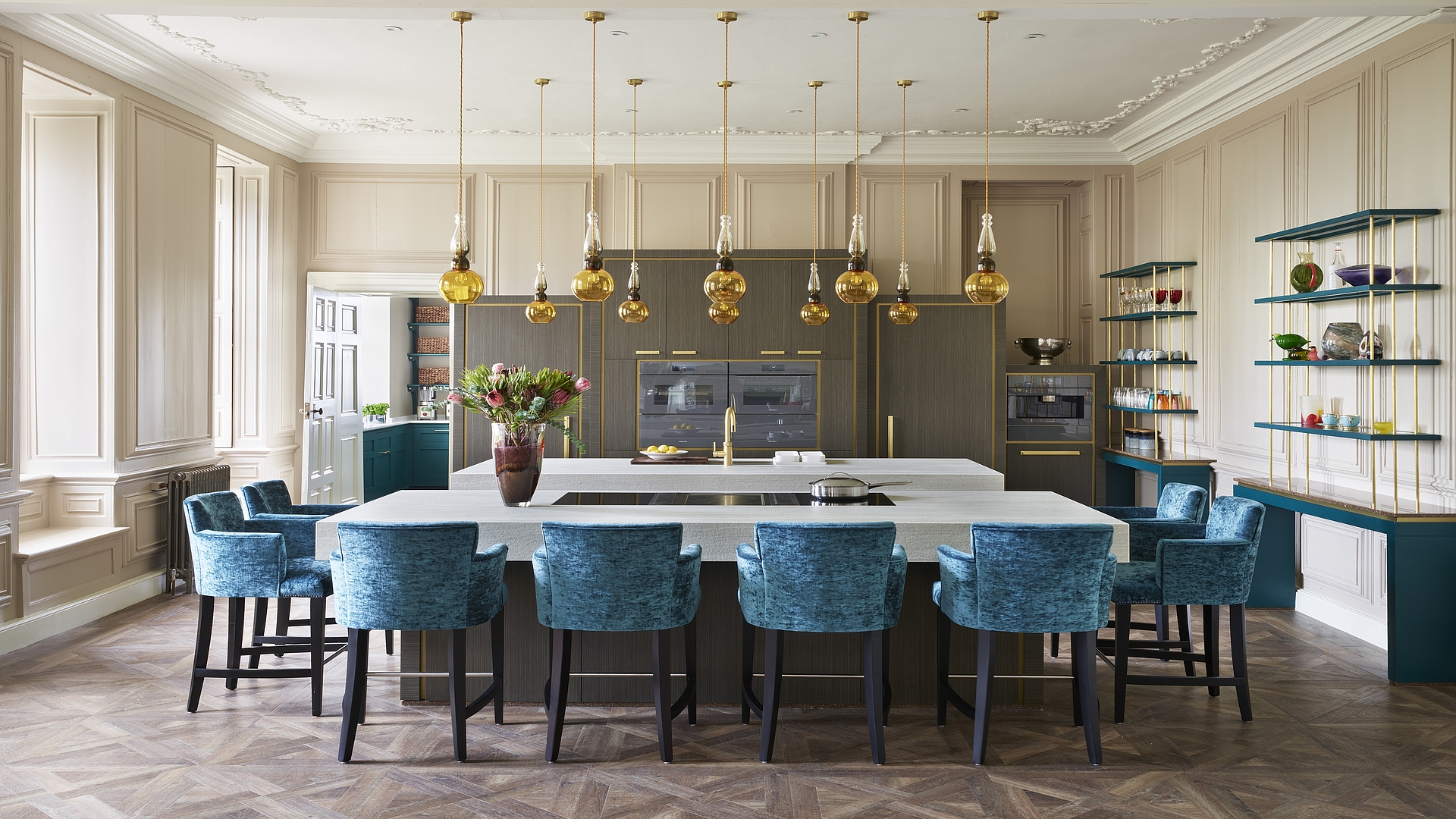
A bit like modern art gallery
A young family breathes new life into an English manor house. The focal point is a bright and colourful hi tech kitchen, which draws attention to the early Georgian architecture, at the same time bringing it into the here and now.
IT WAS LOVE AT FIRST SIGHT
It was love at first sight. But it took seven long years until the initial infatuation became a serious relationship. It took that long for the sale to go through and for the English manor to finally change hands. The new owners: a young married couple, who seven years earlier had fallen in love with the feudal building dating from the 15th century. And the funny thing is that both of them have very modern tastes! For that very reason, the vision of the brand new owners was to keep as much as possible of the existing architecture but to make clear adjustments geared towards modern living requirements. Within the historic walls, they wanted to make a home for themselves and their four young children.
To design the kitchen, the heart of their new home, they hired the services of Martin Holliday. They already knew each other: as the Design Director of Chiselwood, the interior design and kitchen studio that he runs together with his wife Mel in the English city of Lincoln, he had already designed a dressing room and the kitchen for the previous owners of the family’s former home. Due to his experience working with period and listed buildings, the designer and skilled furniture maker seemed to be just the man for the project. His ability to design a whole room and not just the kitchen furniture spoke for him. “As we knew the customers well, we felt confident that they would go along with our suggestion,” Martin Holliday tells us and proved to be right: the house owners practically gave him free rein as far as the design was concerned.
A SYMBIOSIS OF THE OLD AND THE NEW
The requirements were clear: on the one hand, the customers wanted to keep the predominantly 18th-century details like the moulding on the ceiling, the wainscoting, the marble fireplace and the original window shutters and doors. On the other hand, they wanted a practical room that would be suitable for both informal family meals and social evenings with guests. Holliday’s solution: “All of the furniture is free-standing and is only fixed in place with a few screws. I didn’t think it was right to interfere with a room that was created so long ago. I didn’t want to damage anything.”
THE FOCAL POINT OF THE KITCHEN IS A FOOD PREPARATION AREA DESIGNED FOR LIVE COOKING
The 15-metre-long main room is divided into different areas by two kitchen islands of the same size. The focal point of the kitchen is a food preparation area designed for live cooking. Guests can take their place on the nine cushioned bar stools around the solid stone tabletop and watch as the chef prepares the meals on the double BORA cooktop with an additional Tepan stainless steel grill. Thanks to the powerful and at the same time very quiet BORA cooktop extractor, neither the noise of the extractor nor strong cooking vapours, let alone smells, disturb communication. The twin island nearby contains a large sink and two dishwashers. The kitchen planner placed the oven, fridge and freezer, as well as the coffee machine, at the head of the giant room in the front of a unit that hides a secret: “If in the distant future the kitchen is taken out, somebody will get a big surprise,” predicts Martin Holliday. Behind the wall of units with the fitted appliances, there is a second marble fireplace exactly the same as the one at the other end of the room. Holliday left it in its original state out of respect for the history of the house, and simply concealed it.
The other fireplace opposite, with its abundant stucco décor, acts as a backdrop for the dining table with its 14 chairs and forms a stylistic counterpoint. The table was also custom-made in the Chiselwood workshop. An allusion to a mediaeval refectory table, it sits on two wide tapering feet. Blue, yellow, red – Holliday wasn’t afraid of using vivid, eye-catching colours in a historic atmosphere, whereby the whole effect somehow has a hint of British Colonial Style. All in all, with this unusual mix the designer has managed to create a totally unique kitchen, which combines the old and the new and has a classic but, at the same time, very modern feel. “A bit like a modern art gallery in an old building,” he says.
Interior design studio: Chiselwood
BORA System: BORA Professional 2.0, surface induction cooktop, cooktop extractor, Tepan stainless steel grill
Photos: Darren Chung