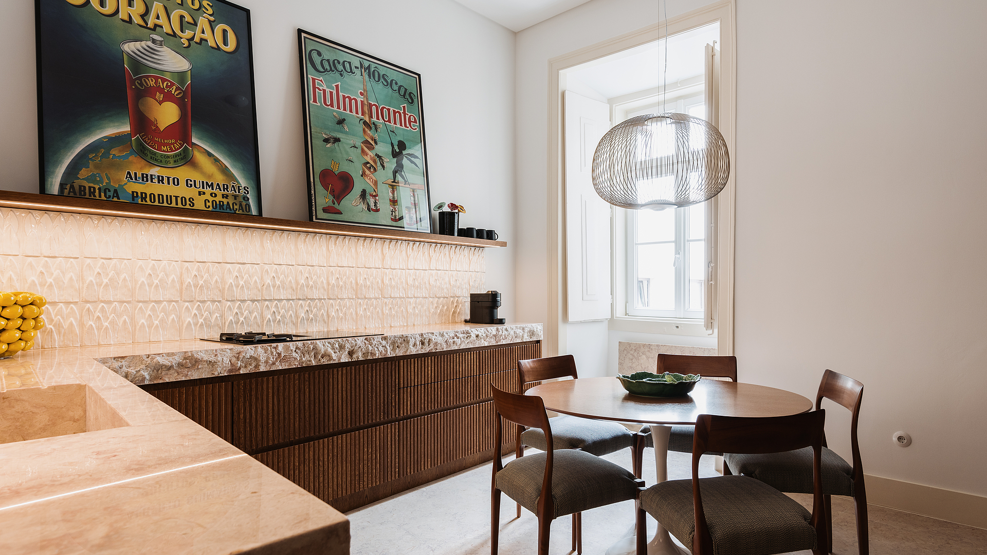
A kitchen with Portuguese character
A fresh take on tradition – that’s how you could describe the style of this kitchen in a period apartment located in the heart of Lisbon. Here, a typically vibrant Portuguese style goes hand in hand with modern clarity, rounded off with the pure design of a BORA Classic 2.0.
Characteristics of the kitchen:
Kitchen design: L-shape
Kitchen style: modern
Kitchen size: 2.60 m x 3.20 m
Materials: units and fronts made of ribbed oak veneer, marble worktop
House architect: So Archi Studio, so-archi-studio.com, Instagram: soarchistudio
BORA partner: Koklatt, www.koklatt.com, Instagram: koklatt
Location: Lisbon, Portugal
BORA products: BORA Classic 2.0
Photographer: Eduardo Montenegro, www.emontenegro.net
A skilful interplay of old and new
The apartment in question is located in a nearly 100-year-old building in one of Lisbon’s oldest districts, right in the heart of the city. With a keen sense for the character of the old building, the apartment was renovated under the direction of the local architect’s office So Archi Studio, which adopted a very progressive modern design at the same time.
The kitchen is the best example of the successful balancing act between tradition and modernity, as it takes up traditional Portuguese interior design elements and gives them a new twist. The strength, personality and uniqueness of the materials used play a key role here. “They’re the stars of the show.” This is how the kitchen planners from the Koklatt studio talk about them when describing their work.
The kitchen design is based on “a functional yet minimalist design”, as emphasised by the planners. But that alone doesn’t make the kitchen so special – this is achieved above all by the details that echo the inhabitants’ personality, thus creating a real one-of-a-kind kitchen.
A kitchen that’s as individual as its inhabitants
Portuguese furniture is generally made of dark wood and is often adorned with carvings. The dark oak kitchen fronts are reminiscent of this tradition, but instead of playful carvings they feature a vertical ribbed structure that is bang on trend right now.
The vertical lines of the wooden fronts add a touch of elegance and vibrancy to the kitchen, as do the deliberately chosen decorative elements. An extravagant-shaped ‘lemon’ bowl and various warm-coloured advertising posters look young and fresh, rounding off the extraordinary kitchen profile to perfection.
The tiled backsplash in the kitchen also appears to be a nod to a Portuguese tradition, i.e. azulejos, the tiled works of art that can still be found on many façades in the country today. However, the monochrome surface structure creates a resolutely modern feel.
A strictly low-key look
The massive marble worktop with its broken edge finish is anything but run-of-the-mill. It sits enthroned upon the wooden kitchen units as a real eye-catcher. A single illuminated shelf seems to float above it, giving the kitchen an amazing lightness despite the expanse of built-in materials.
The planners opted for a BORA cooktop extractor system so that this ‘clean look’ wouldn’t be disrupted by an extractor hood. They chose the modular BORA Classic 2.0 system, which has freely selectable cooktops – another way of lending the kitchen an individual touch.
The many well-thought-out details thus blend into a kitchen ensemble with an individual soul and a pinch of Portugal: inviting and cosy, but also elegant and clear in design, without any superfluous elements which would negatively affect the overall picture.