A stylish departure from country house clichés
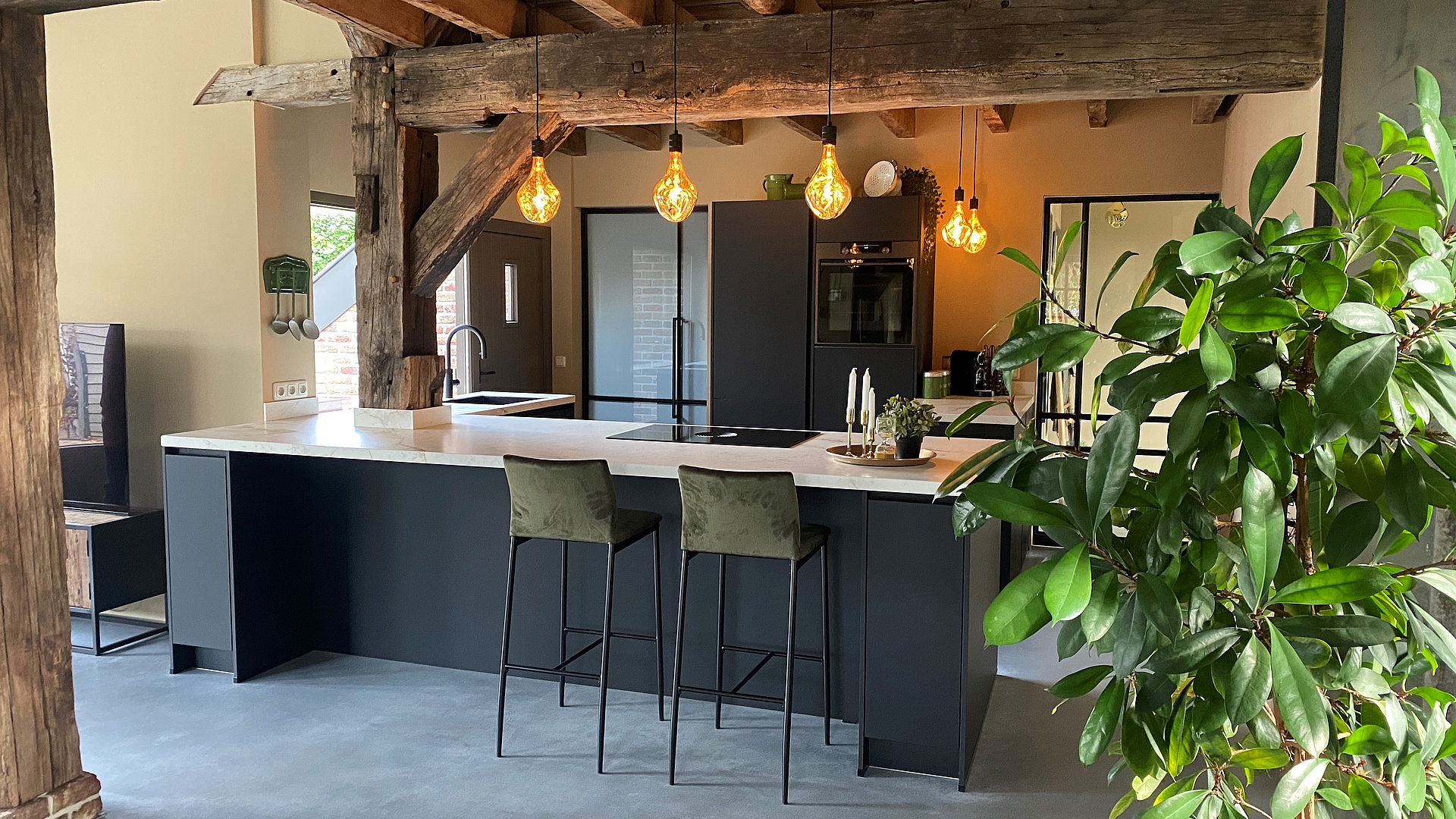
If you think modern kitchens don’t suit old farmhouses then think again. This minimalist black & white kitchen design just goes to prove the contrary: the clear lines of the open-plan cooking area with a BORA Pure in the centre add an exceptionally sophisticated touch to the rustic ambiance.
Credits:
ERBEE Keukens
www.erbeekeukens.nl
Instagram: erbee_keukens
Facebook: ERBEE Keukens
Characteristics of the kitchen:
BORA partner and architect: ERBEE Keukens, www.erbeekeukens.nl, Instagram: erbee_keukens
Location: Weert, Netherlands
Kitchen design: L-shaped kitchen island, appliance cabinet and mini counter
BORA products: BORA Pure
Materials: ceramic worktop, graphite black kitchen fronts
Photographer: ERBEE Keukens
The birth of a new living atmosphere
Crooked beams, uneven walls and low ceilings lend old farmhouses their distinctive character. For architects and interior designers, however, these charming deviations from the norm present a challenge because they make it virtually impossible to implement any standard solutions. Instead, a great deal of creativity and dexterity is called for when planning old buildings such as these.
However, if planning professionals are able to adapt to the situation and handle the existing building structure with care, great things can be achieved. This is precisely what happened in this farmhouse in the Dutch town of Weert, which took on an all-new living atmosphere full of light and space after its complete renovation.
The only thing that remains of the interior walls are the supporting wooden beams. That way, the view now extends throughout the living, dining and cooking area as well as into the garden through the large windows. The elegant, purist kitchen contrasts starkly with the otherwise rather rustic interior, but its restrained design makes it an absolute eye-catcher.
Perfection lies in the smallest detail
The kitchen planners from ERBEE Keukens succeeded at harmoniously, or even symbiotically, integrating the modern kitchen architecture into the farmhouse with all of its nooks and crannies. The most obvious example is the oak beam which seems to grow out of the light-coloured ceramic worktop like a tree.
But the planners didn’t just incorporate the beam into their concept. All of the kitchen elements blend naturally into the surroundings because their overall forms adapt to the shape of the room. For example, the extra-wide kitchen island was extended slightly – a trick that makes perfect use of the existing space.
The sink is located directly in front of the large window on the short leg of the L-shaped island, whereas the BORA Pure cooktop with integrated downdraft extractor sits enthroned atop the longer leg. As a result of this layout, guests can make themselves comfortable on the bar stools around the island and chat effortlessly with the chef. At the same time, they aren’t disrupted by any cooking vapours thanks to the effective BORA extractor system.
Black & white clarity as a deliberate style break
To complement the graphite black kitchen fronts, the Dutch kitchen professionals chose a ceramic worktop that imitates light natural stone. The black sink and tap and the BORA Pure cooktop add dark accents to the light-coloured worktop. This creates a consistent, very elegant looking light & dark mix as a contrast to the surrounding country house cosiness.
This style break brought about by the minimalist modern kitchen gives the whole thing a certain je ne sais quoi and turns the farmhouse into a luxurious chalet. Expressive pendant lights with a warm colour temperature suspended above the kitchen island and the narrow counter via black cables create a clear visual link between the two style worlds.
The uniform grey floor covering which runs through the entire room also has a connecting effect. Its calm design sets the stage for the dream kitchen’s impressive appearance. The planners’ aim to create an aesthetic mix of historical and modern elements is therefore a complete success.