From book cover to kitchen design
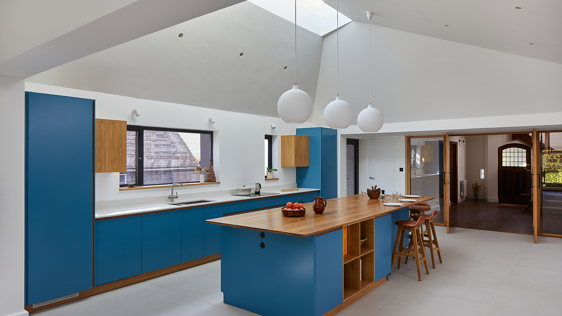
What does this kitchen have in common with a book cover? The same bright colour that makes it a real eye-catcher. But this kitchen is also totally unique when it comes to its materials and decoration.
Photos:
Chris Snook
Good things come to those who wait
A book cover provided the inspiration for the striking blue of these kitchen fronts. The kitchen studio immersed these fronts into the exact same shade as the literary original. But that’s not all: this unique kitchen – which was designed as a modern extension to a traditional property in North Hertfordshire (UK) – boasts many other details.
Our attention is immediately grabbed by the bar stools by Danish designer Erik Buch, or the Dekton worktop with its integrated rectangular sink and a BORA Pure cooktop extractor system. “It was an absolute pleasure to design this wonderful kitchen for these book-loving customers!”, recalls Tomas Hinton, founder of Tomas Kitchen Living.
However, the kitchen designer has less fond memories of the kitchen installation itself, because it dragged on due to the lockdown that was in force in the UK at the time. But this unique classic-modern kitchen came into being against the odds, blending in perfectly with the unusual, ultra-modern extension to the 1930s property.
Meticulously planned
The dazzling blue was custom-made by the kitchen studio. It was specially mixed at the customer’s request to match a particular book cover. This “book” blue is accompanied by natural oak which features on the plinths, the expansive kitchen island countertop, the shelves nestling within the island and the symmetrical wall units fitted above the kitchen units.
As Tomas Hinton explains, symmetry played an extremely important role when designing this kitchen: “One of the biggest challenges was to ensure the same distances between the windows and the cupboards, which required additional site visits, lengthy discussions with the owners and the manufacture of tailor-made drawers.”
It therefore goes without saying that the elements in the white Dekton worktop had to be arranged harmoniously according to the laws of symmetry. As such, the sink sits exactly below the centre of the large window, and the BORA Pure cooktop with its downdraft extractor is placed precisely in the middle of the gap between the large and small window. The flush-mounted sink and cooktop blend seamlessly into the surface.
Design and functionality in perfect harmony
Some more interesting details become apparent upon closer inspection of the kitchen: for example, at the head of the kitchen island, below the large oak countertop, Tomas Hinton placed two sockets from the BORA accessory range, which are handy for plugging in all kinds of small kitchen appliances. Once they’ve been used, mixers & other such items disappear into the cupboards again.
Corresponding BORA sockets are also located above the kitchen unit worktop. This shows that the planner left nothing to chance and wanted even the smallest components to match the overall kitchen concept.
The designer stools placed around the kitchen island also match the kitchen aesthetics. They’re based on well-known designs from 1961 by Danish industrial designer Erik Buch. The wooden frame goes perfectly with the wood of the kitchen furniture – a result which makes the owners and the designer equally satisfied.